buildfire.components.skeleton
Skeleton is a flexible component to provide any plugin an indication to the user that something is loading but not yet available. There are rich pre-defined options available that can be combined to build different variations of skeletons.
Skeletons adapts to your theme colors and no efforts required to match them with your theme, however you still can override the colors if you need to.
Requirements
Widget
<head>
  <!-- CSS -->
  <link rel="stylesheet" href="../../../styles/components/skeleton.css" />

  <!-- JS -->
  <script src="../../../scripts/buildfire.min.js"></script>
  <script src="../../../scripts/buildfire/components/skeleton/skeleton.js"></script>
</head>
For the component to work properly, always include both CSS and JS files even if you're only using CSS method.
Usage
This component provides the user with a visual indicator that content is loading. This is better received than traditional full-screen loaders, and it can be used in two ways:
- Use various pre-defined options, mix and match them to come up with the perfect match for your designs. See example.
- Create your own unique implementations by simply adding the class
bf-skeleton-loaderto any empty HTML element. See example.
skeleton
Class constructor method which initializes the skeleton component.
skeleton()
const skeleton = new buildfire.components.skeleton(selector, options);
const skeleton = new buildfire.components.skeleton('body', {
  type: 'card-avatar',
}).start();
Arguments
| Name | Type | Required | Description | Default |
|---|---|---|---|---|
selector | string | yes | A string containing selector to match. This string must be a valid CSS selector string; if it isn't, a SyntaxError exception is thrown. Having multiple containers with the same selectors would apply the skeletons to these elements as well. | |
options | object | yes | options object |
options
| Name | Type | Required | Description | Default |
|---|---|---|---|---|
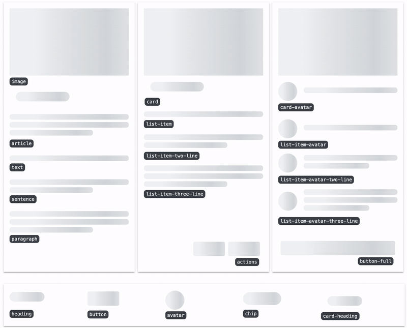
type | string | yes | A comma seperated string delimited list of skeleton components to create such as type: 'heading, image'. Following are a complete list of the available pre-defined options: text, heading, button, actions, button-full, sentence, paragraph, image, avatar, chip, card-heading, article, list-item, list-item-two-line, list-item-three-line, list-item-avatar, list-item-avatar-two-line, list-item-avatar-three-line, card, card-avatar | |
hideContent | boolean | false | Hide all of the visible elements within the container upon starting skeletons using skeleton.start(), content will be shown back once the skeletons are stopped using skeleton.stop(). | true |
Methods
skeleton.start()
skeleton.start()
Start rendering the desired types together with the animation effect.
const skeleton = new buildfire.components.skeleton('body', { type: 'card-avatar' });

skeleton.start();
skeleton.stop()
skeleton.stop()
Stop and clear animation.
const skeleton = new buildfire.components.skeleton('body', { type: 'card-avatar' });

skeleton.stop();
Examples
Using pre-defined options
Example 1
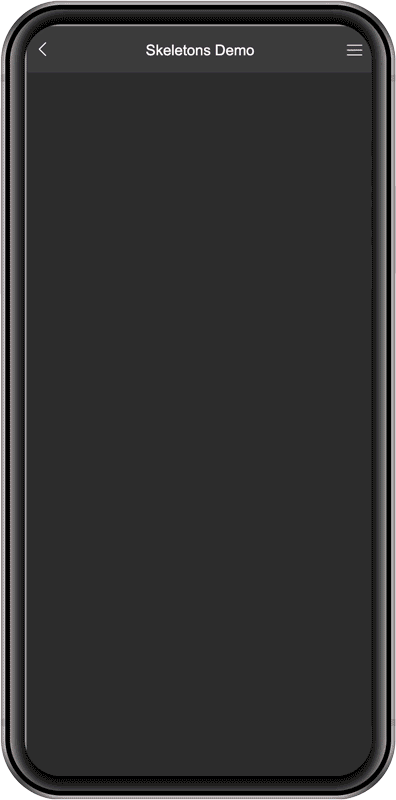
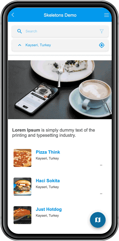
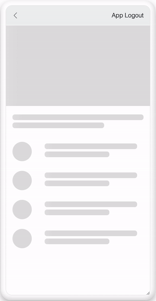
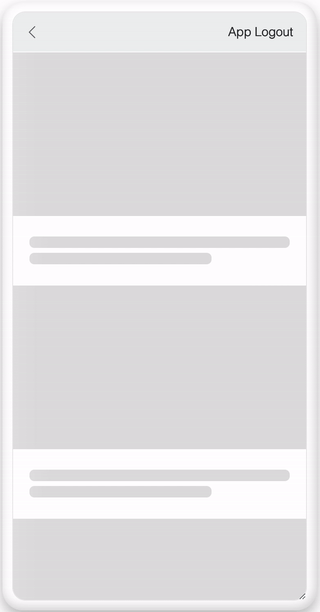
In this example, we are utilizing the skeleton loader for a full page that consists of a carousel, sentence, and a list:
Code
// build and start your skeletons before everything else
const skeleton = new buildfire.components.skeleton('body', {
    type: 'image, sentence, list-item-avatar-two-line, list-item-avatar-two-line',
}).start();

// start your asynchronous operations and stop skeletons after they are done
setTimeout(() => {
    skeleton.stop();
}, 2000);
Preview
Example 2
Another example using pre-defined options, but here we have added the selector to multiple elements:
Code
<body>
<div class="post"></div>
<div class="post"></div>
<div class="post"></div>

<script>
    const skeleton = new buildfire.components.skeleton('.post', { type: 'image, sentence' }).start();
</script>
</body>
Preview
Using class only
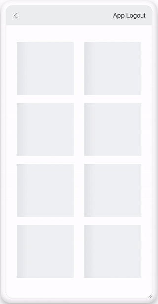
An example where we use bf-skeleton-loader class to build a basic grid layout. This approach is recommended if you want more control over the look of the skeleton instead of a pre-defined skeleton.
Make sure you set the height and width for elements with bf-skeleton-loader class.
Code
<head>
  <style>
    .row {
      display: flex;
      justify-content: space-between;
      margin: 20px 0;
    }

    .grid-block {
      height: 130px;
      width: 140px;
    }
  </style>
</head>
<body>
<div class="row">
  <div class="bf-skeleton-loader grid-block"></div>
  <div class="bf-skeleton-loader grid-block"></div>
</div>
<div class="row">
  <div class="bf-skeleton-loader grid-block"></div>
  <div class="bf-skeleton-loader grid-block"></div>
</div>
<div class="row">
  <div class="bf-skeleton-loader grid-block"></div>
  <div class="bf-skeleton-loader grid-block"></div>
</div>
<div class="row">
  <div class="bf-skeleton-loader grid-block"></div>
  <div class="bf-skeleton-loader grid-block"></div>
</div>
</body>
Preview
Full Preview