buildfire.components.control.tagsInput
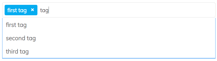
The tags component provides a simple way to display and organize multiple tags. Each tag is a label that describes a specific attribute or characteristic of the item.
This component is typically used on the control side and allows users to add, edit, and remove tags dynamically.
Requirements
Control
<head>
  <!-- CSS -->
  <!-- Load helper.css to use our helper classes -->
  <link href="../../../../styles/helper.css" rel="stylesheet" />
  <link href="../../../../styles/siteIcons.css" rel="stylesheet" />
  <link href="../../../../styles/components/control/tagsInput/tagsInput.min.css" rel="stylesheet"/>

  <!-- JS -->
  <script src="../../../../scripts/buildfire.min.js"></script>
  <script src="../../../../scripts/buildfire/components/control/tagsInput/tagsInput.min.js"></script>
</head>
In your Control body create html container element that will hold the tags input component.
<body>
  <div id="tagsInputContainer"></div>
</body>
Methods
tagsInput()
Add the following javascript after setting the container:
const tags = new buildfire.components.control.tagsInput("#tagsInputContainer", options);
Class instance for Tags Input. Typically used on the control side to add tags from the user input.
Arguments
| Name | Type | Required | Description | Default |
|---|---|---|---|---|
selector | string | yes | CSS selector of the element which will contain the sortable list | |
options | object | no | Options object |
options
| Name | Type | Required | Description | Default |
|---|---|---|---|---|
languageSettings | object | no | LanguageSettings object | |
settings | object | no | Settings object |
options.languageSettings
| Name | Type | Required | Description | Default |
|---|---|---|---|---|
placeholder | string | no | Placeholder of the input | "Select Tags" |
options.settings
| Name | Type | Required | Description | Default |
|---|---|---|---|---|
sourceType | string | no | Specifies the type of the tags component input list, custom | "list" |
source | [tag] | no | Array of tags list that will be displayed in the input or a custom function in case source type is custom | |
allowUserInput | boolean | no | Enable adding custom tags from keyboard | true |
allowAutoComplete | boolean | no | Used only when the allowUserInput is enabled and sourceType is list. it allows the user to auto-complete the tag name from the list by clicking right arrow | true |
maxTags | number | no | Specifies the maximum number of selectable tags. If not provided, there is no limit on selection. | null |
tag
Found in the array options.settings.source.
Each object in the source array must contain a value property which is the name of the tag, and you can append as many additional custom properties as you want.
| Name | Type | Required | Description | Default |
|---|---|---|---|---|
value | string | yes | Name of the tag | |
| custom properties | any | no | Custom properties set by developer. Can be any key-value pair. |
Using custom sourceType
source should be a function with two arguments (options, callback).
In addition, pass options.settings.sourceType as 'custom'.
options
Can be passed as null. This is reserved for future usage
callback(tags)
Callback function called with the selected tags to be set in the tags input component.
| Name | Type | Description |
|---|---|---|
tags | [object] | Array of tag objects |
List sourceType Full Example
// list sourceType
const listTagsInput = new buildfire.components.control.tagsInput("#listTagsInputContainer", {
    languageSettings:{
        placeholder: "Select Tags",
    },
    settings:{
        source: [{ value: 'first tag' }, { value: 'second tag' }, { value: 'third tag' }],
        sourceType: 'list',
        allowAutoComplete: true,
        allowUserInput: true,
    }
});
Custom sourceType Full Example
// custom sourceType
const customTagsInput = new buildfire.components.control.tagsInput("#customTagsInputContainer", {
    languageSettings:{
        placeholder: "Select Tags",
    },
    settings:{
      sourceType: 'custom',
      source: (options, callback) => {
        buildfire.auth.showUsersSearchDialog(null, (err, result) => {
          if (err) return console.log(err);

          if (result && result.users) {
            let allTags = result.users.map(user => ({value: user.username}));

            callback(allTags);
          }
        });
      },
      allowAutoComplete: true,
      allowUserInput: true,
    }
});
append()
tagsInput.append(tags)
Appends a tag or many tags to the tags input.
const tagsInput = new buildfire.components.control.tagsInput("#tagsInputContainer", options);

tagsInput.append([
  {
    value: 'first tag'
  },
  {
    value: 'second tag'
  }
]);
Arguments
| Name | Type | Required | Description | Default |
|---|---|---|---|---|
tags | [object] | yes | Array of tags to be appended to the tags input |
set()
tagsInput.set(tags)
Apply the provided tags to the component and remove any existing tags.
const tagsInput = new buildfire.components.control.tagsInput("#tagsInputContainer", options);

tagsInput.set([
  {
    value: 'first tag'
  },
  {
    value: 'second tag'
  }
]);
Arguments
| Name | Type | Required | Description | Default |
|---|---|---|---|---|
tags | [object] | yes | Array of tags to be set in the user tags. |
get()
tagsInput.get()
Returns an array of the selected tags from the tags component.
const tagsInput = new buildfire.components.control.tagsInput("#tagsInputContainer", options);

const tags = tagsInput.get();
clear()
tagsInput.clear()
Clears the tags component
const tagsInput = new buildfire.components.control.tagsInput("#tagsInputContainer", options);

tagsInput.clear();
Handlers
The following event handlers can be assigned:
onUpdate()
tagsInput.onUpdate(data)
Allows you to pass a callback function that is called whenever a tag is updated.
const tagsInput = new buildfire.components.control.tagsInput("#tagsInputContainer", options);

tagsInput.onUpdate = (data) => {
  console.log('tags updated ', data)
}
Arguments
| Name | Type | Description |
|---|---|---|
data | object | Object contains the list of tags selected in the tags input |
data
| Name | Type | Description |
|---|---|---|
tags | [tag] | Array of tags selected in the tags component |
buildfire.components.control.userTagsInput
userTagsInput()
It is an inheritance of tagsInput and contains the same methods and handlers. It's configured to load and update the tags using the Buildfire users tags dialog.

const userTagsInput = new buildfire.components.control.userTagsInput("#userTagsContainer", options);
Arguments
| Name | Type | Required | Description | Default |
|---|---|---|---|---|
selector | string | yes | CSS selector of the element which will contain the sortable list | |
options | object | no | Options object |
options
| Name | Type | Required | Description | Default |
|---|---|---|---|---|
languageSettings | object | no | LanguageSettings object | |
settings | object | no | Settings object |
options.languageSettings
| Name | Type | Required | Description | Default |
|---|---|---|---|---|
placeholder | string | no | Options object | "Select Tags" |
options.settings
| Name | Type | Required | Description | Default |
|---|---|---|---|---|
maxTags | number | no | Specifies the maximum number of selectable tags. If not provided, there is no limit on selection. | null |
Full Examples
const userTagsInput = new buildfire.components.control.userTagsInput("#userTagsContainer", {
    languageSettings:{
        placeholder: "Select Tags"
    }
});