buildfire.components.control.listView
The Control List View component is a versatile tool designed for displaying lists of items in a standardized manner. It comes equipped with a search bar, sorting capabilities, and options for adding items individually or in bulk, among other features.
Requirements
After injecting the buildfire.min.js inject sortable.min.js as well because it is required for the component to work properly. Finally, inject the component css file listView.css and js file listView.js
Control
<head>
  <!-- ... -->
  <script src="../../../../scripts/buildfire.min.js"></script>
  <script src="../../../../scripts/sortable.min.js"></script>

  <link rel="stylesheet" href="../../../../styles/components/control/listView/listView.css"></link>
  <script src="../../../../scripts/buildfire/components/control/listView/listView.js"></script>
</head>
Methods
listView()
new buildfire.components.control.listView(selector<String>, options<Object>)
Class constructor method which initializes the Control List View component.
Arguments
| Name | Type | Required | Description | Default |
|---|---|---|---|---|
selector | string | yes | CSS selector of element that will contain component | |
options | object | false | Options object. |
options
| Name | Type | Required | Description | Default |
|---|---|---|---|---|
appearance | object | no | Specifies appearance of certain elements | |
settings | object | no | Specifies functionalities inside the component | |
contentMapping | object | yes | Specifies item mapping keys and columns | |
addButtonOptions | array | no | Specifies dropdown options on add button | |
sortOptions | array | no | Specifies sort options inside the component |
options.appearance
| Name | Type | Required | Description | Default |
|---|---|---|---|---|
title | string | no | Specifies the title of the list. | |
info | string | no | Specifies the info section of the list. | |
addButtonText | string | no | Specifies the add button text. | "Add item" |
addButtonStyle | string | no | Specifies the add button appearance. "filled or outlined" | "filled" |
itemImageEditable | boolean | no | Specifies whether the image of the item in the list should be editable or not. | "true" |
itemImageStyle | string | no | Specifies the shape of the item image circle, square, avatar, none | "square" |
If itemImageEditable is set to false placeholder image will be applied to the list items based on the choosen item image style
options.settings
| Name | Type | Required | Description | Default |
|---|---|---|---|---|
showSearchBar | boolean | no | Specifies whether the search bar should show or not. | false |
showSortOptions | boolean | no | Specifies whether the sort options should show or not. | false |
showAddButton | boolean | no | Specifies whether the add button should show or not. | false |
allowDragAndDrop | boolean | no | Specifies whether the drag handle should show or not | true |
showEditButton | boolean | no | Specifies whether the item edit button should show or not. | true |
showDeleteButton | boolean | no | Specifies whether the item delete button should show or not. | true |
paginationEnabled | boolean | no | If pagination is enabled onDataRequest provides the page and the pageSize. | false |
paginationOptions | object | no | paginationOptions object. |
options.settings.paginationOptions
| Name | Type | Required | Description | Default |
|---|---|---|---|---|
page | number | no | Specifies the starting page for the data | 0 |
pageSize | number | no | Specifies the page size for the data | 10 |
options.contentMapping
| Name | Type | Required | Description | Default |
|---|---|---|---|---|
idKey | string | no | Specifies the id field of the item. | "id" |
columns | array | no | Specifies the columns for items displayed in the component. |
options.contentMapping.columns
This object uses keys to denote the type of content each column should display and values to specify the data source of that content. Available column keys are:
| Column Key | Description |
|---|---|
titleKey | For titles, stylized to be bold and ellipsis. |
subtitleKey | For subtitles, displayed below the first key. |
anchorKey | For HTML anchor values, stylized via CSS. |
imageKey | Used to render images. Cannot be combined with other keys. |
toggleKey | Adds a toggle input field. Cannot be combined with other keys. |
dateKey | For date values, formatted to a string date. |
options.addButtonOptions
| Name | Type | Required | Description | Default |
|---|---|---|---|---|
title | string | yes | Specifies the title value of the option in the dropdown menu. |
Using options.addButtonOptions will add the dropdown to the button.
options.sortOptions
| Name | Type | Required | Description | Default |
|---|---|---|---|---|
title | string | yes | Specifies the title value of the option in the dropdown menu. |
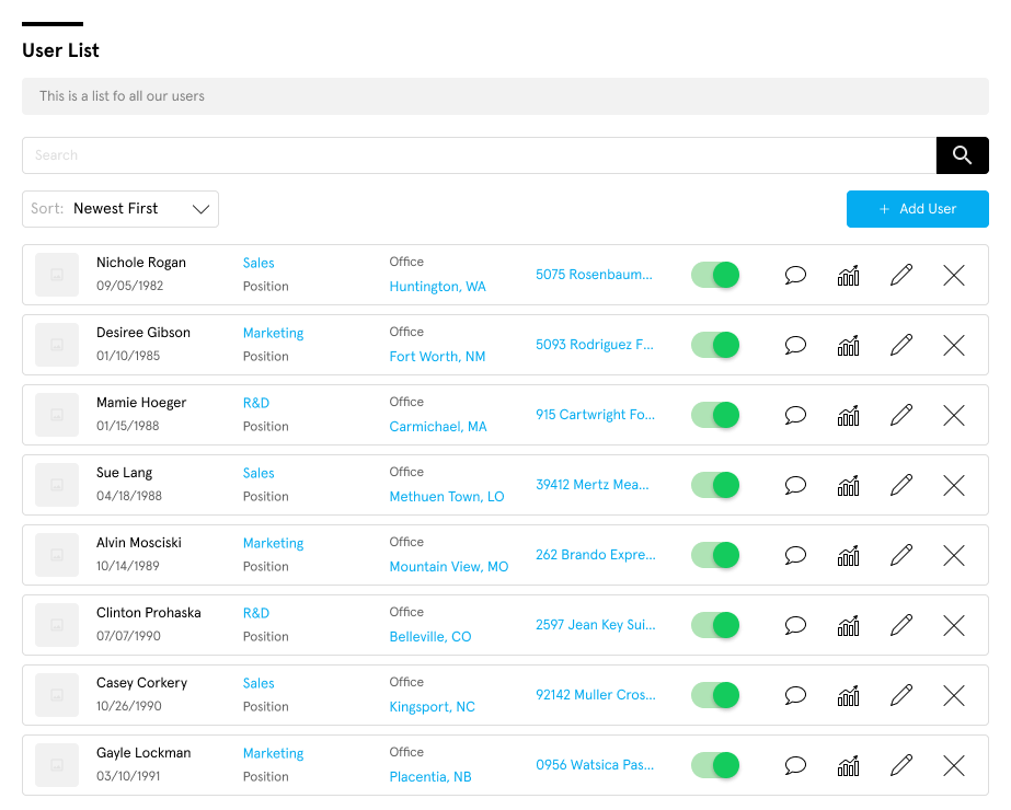
Example
  const options = {
    appearance: {
      title: 'Control List View',
      info: "Some description of the control list",
      addButtonText: "Add Feed",
      addButtonStyle: "outlined",
      itemImageEditable: false,
    },
    addButtonOptions: [
      { title: "Add New" },
    ],
    settings: {
      allowDragAndDrop: true,
      showSearchBar: true,
      showSortOptions: true,
      showAddButton: true,
      showEditButton: true,
      showDeleteButton: true,
      paginationEnabled: true, //we enable pagination
      paginationOptions: {
        page: 0,
        pageSize: 5 //we set our custom page size
      },
      contentMapping: {
        idKey: "id",
        manualOrderKey: "data.manualOrder",
        columns: [
          { imageKey: "data.imageUrl" },
          { titleKey: "data.title", subtitleKey: "data.subtitle" },
          { dateKey: "data.createdOn", anchorKey: "data.address" },
          { toggleKey: "data.isActive" }
        ],
      }
    },
    sortOptions: [
      { title: "Newest First", },
      { title: "Oldest Z-A", default: true }
    ]
  }

  let controlListView = new buildfire.components.control.listView("#listView_container", options);
append()
function buildfire.components.control.listView.append(items<Array>, appendToTop<Boolean>)
Appends an item or many items to the list view
Arguments
| Name | Type | Required | Description | Default |
|---|---|---|---|---|
items | array or object | yes | Array of items, or single item to be appended to list view. | |
appendToTop | boolean | no | Specifies whether items should be applied to the top or the bottom of the list. | false |
Example
const options = {
    settings: {
        contentMapping: {
        idKey: "id",
        manualOrderKey: "data.manualOrder",
        columns: [
          { titleKey: "data.title", subtitleKey: "data.subtitle" },
          { dateKey: "data.createdOn" }
        ],
      }
    }
}

let controlListView = new buildfire.components.control.listView("#listView_container", options);

controlListView.append([
    { id: 1, data: { title: 'Item 1', subtitle: 'subtitle 1', createdOn: 1694642517971 }},
    { id: 2, data: { title: 'Item 2', subtitle: 'subtitle 2', createdOn: 1694743518971 }}
]);
update()
function buildfire.components.control.listView.update(id<String>, data<Object>)
Updates an item and re-renders it in the list
Arguments
| Name | Type | Required | Description | Default |
|---|---|---|---|---|
id | string | yes | Item id | |
data | object | yes | Item data to be updated |
Example
const options = {
    settings: {
        contentMapping: {
            idKey: "id",
            columns: [{ titleKey: "title" }]
        }
    }
}

let controlListView = new buildfire.components.control.listView("#listView_container", options);

controlListView.update(1, { id: 1, title: 'Updated Item' });
remove()
function buildfire.components.control.listView.remove(id<String>)
Removes an item from the list view
Arguments
| Name | Type | Required | Description | Default |
|---|---|---|---|---|
id | string | yes | Item id |
Example
const options = {
    settings: {
        contentMapping: {
            idKey: "id",
            columns: [{ titleKey: "title" }]
        }
    }
}

let controlListView = new buildfire.components.control.listView("#listView_container", options);

controlListView.append([
    { id: 1, title: 'Item 1' },
    { id: 2, title: 'Item 2' }
]);

controlListView.remove(1);
clear()
function buildfire.components.control.listView.clear()
Clears the list of items in the list view
Example
const options = {
    settings: {
        contentMapping: {
            idKey: "id",
            columns: [{ titleKey: "title" }]
        }
    }
}

let controlListView = new buildfire.components.control.listView("#listView_container", options);

controlListView.append([
    { id: 1, title: 'Item 1' },
    { id: 2, title: 'Item 2' }
]);

controlListView.clear();
refresh()
function buildfire.components.control.listView.refresh()
Refreshes the component to apply changes and re-render items
const controlListView = new buildfire.components.control.listView('#listView_container', options);

controlListView.options.settings.showSearchBar = false;// hides the search bar
controlListView.refresh();
reset()
function buildfire.components.control.listView.reset()
Resets the component to its initial state
const controlListView = new buildfire.components.control.listView('#listView_container', options);

controlListView.reset();
Handlers
onDataRequest()
function onDataRequest(event<Object>, callback<Function>)
Triggered when:
- The component loads for the first time
- The user is using the search bar
- Calling
refresh()orreset() - Selecting the sort option
If you don't want to use this handler you can populate the list using the append method
Arguments
| Name | Type | Required | Description | Default |
|---|---|---|---|---|
event | object | yes | Contains search value and current sort option. | |
callback | function | yes | Provides callback to retrieve items back to the component to render. |
event
| Name | Type | Required | Description | Default |
|---|---|---|---|---|
searchValue | string | yes | Contains search value from the search bar if any. | |
sortOption | object | yes | Contains choosen sort option if any. |
callback
| Name | Type | Required | Description | Default |
|---|---|---|---|---|
items | array | yes | Array of items that need to be rendered inside the component. |
const options = {
    settings: {
        contentMapping: {
            idKey: "id",
            columns: [{ titleKey: "title" }]
        }
    }
}

const items = [
    { id: 1, title: "John Smith" },
    { id: 2, title: "Will Smith" }
];

let controlListView = new buildfire.components.control.listView("#listView_container", options);

controlListView.onDataRequest = (event, callback) => {
    callback(items);
};
onItemRender()
function onItemRender(event<Object>)
Triggered every time before an item is rendered, provides a return statement to specify actions for the item.
Arguments
| Name | Type | Required | Description | Default |
|---|---|---|---|---|
event | object | yes | Contains item object. |
event
| Name | Type | Required | Description | Default |
|---|---|---|---|---|
item | object | yes | Item that is currently being rendered. |
const options = {
    settings: {
        contentMapping: {
            idKey: "id",
            columns: [{ titleKey: "title" }]
        }
    }
}

const items = [
    { id: 1, title: "John Smith" },
    { id: 2, title: "Will Smith" }
];

let controlListView = new buildfire.components.control.listView("#listView_container", options);

controlListView.onDataRequest = (event, callback) => {
    callback(items);
};

controlListView.onItemRender = (event, callback) => {
    let presetOptions = {
        disableDelete: true,
        disableEdit: false,
        deleteButtonTooltip: "item will be deleted permanently"
    };

    let actions = [
        { actionId: "calendar", icon: "calendar", theme: "primary", disabled: true },
        { actionId: "graph", icon: "graph", theme: "primary", tooltipText: 'Sales' },
    ];

    return { actions, presetOptions };
};
return statement
| Name | Type | Required | Description | Default |
|---|---|---|---|---|
actions | array | no | Array of action objects. | |
presetOptions | object | no | Preset options object. |
actions
| Name | Type | Required | Description | Default |
|---|---|---|---|---|
actionId | string | yes | Unique ID of the action. | |
icon | string | no | Specifies the icon of the action. | |
theme | string | no | Specifies the theme of the action. | |
disabled | boolean | no | Disables the action. | false |
tooltipText | string | no | Specifies tooltip text for the action. |
presetOptions
| Name | Type | Required | Description | Default |
|---|---|---|---|---|
disableManualSorting | boolean | no | Disables manual sorting for the item. | false |
disableEdit | boolean | no | Disables edit button for the item. | false |
disableDelete | boolean | no | Disables delete button for the item. | false |
editButtonTooltip | string | no | Tooltip string for edit button. | |
deleteButtonTooltip | string | no | Tooltip string for delete button. |
icons available
onItemClick()
function onItemClick(event<Object>)
Triggered when an item is clicked. Passes the item and column clicked in the event parameter.
Arguments
| Name | Type | Required | Description | Default |
|---|---|---|---|---|
event | object | yes | Contains information for clicked item. |
event
| Name | Type | Required | Description | Default |
|---|---|---|---|---|
item | object | yes | Item that has been clicked. | |
column | object | yes | Column that has been clicked. | |
targetKey | string | yes | Column key of the item that has been clicked. |
const options = {
    settings: {
        contentMapping: {
            idKey: "id",
            columns: [{ titleKey: "title" }]
        }
    }
}

let controlListView = new buildfire.components.control.listView("#listView_container", options);

controlListView.onItemClick = (event) => {
    console.log(event);
}
onItemActionClick()
function onItemActionClick(event<Object>)
Triggered when an item's action is clicked. Passes the item and action in the event parameter.
Arguments
| Name | Type | Required | Description | Default |
|---|---|---|---|---|
event | object | yes | Contains information for clicked item. |
event
| Name | Type | Required | Description | Default |
|---|---|---|---|---|
item | object | yes | Item that has been clicked. | |
actionId | object | yes | Clicked action of the item that has been interacted with. |
const options = {
    settings: {
        contentMapping: {
            idKey: "id",
            columns: [{ titleKey: "title" }]
        }
    }
}

let controlListView = new buildfire.components.control.listView("#listView_container", options);

controlListView.onItemActionClick = (event) => {
    console.log(event);
}
onSearchInput()
function onSearchInput(searchValue<String>)
Triggered when the user types in something in the search bar.
This handler will not be invoked if onDataRequest is being used
Event
| Name | Type | Required | Description | Default |
|---|---|---|---|---|
searchValue | string | yes | Contains the search value. |
const options = {
    settings: {
        showSearchBar: true,
        contentMapping: {
            idKey: "id",
            columns: [{ titleKey: "title" }]
        }
    }
}

let controlListView = new buildfire.components.control.listView("#listView_container", options);

controlListView.onSearchInput = (searchValue) => {
    console.log(searchValue);
}
onSortOptionChange()
function onSortOptionChange(option<Object>)
Triggered when the user selects the sort option from the sort options dropdown.
This handler will not be invoked if onDataRequest is being used
Options
| Name | Type | Required | Description | Default |
|---|---|---|---|---|
option | string | yes | Contains the choosen sort option. |
const options = {
    settings: {
        showSortOptions: true,
        contentMapping: {
            idKey: "id",
            columns: [{ titleKey: "title" }]
        }
    }
}

let controlListView = new buildfire.components.control.listView("#listView_container", options);

controlListView.onSortOptionChange = (option) => {
    console.log(option);
}
Examples
Using with onDataRequest
const items = [
    {
        "id": "6489fe794feadf03a7df37cc",
        "data": {
            "createdOn": "05/06/2023",
            "isActive": false,
            "imageUrl": "http://placehold.it/32x32",
            "title": "Bridgett Lara",
            "subtitle": "SNIPS",
            "address": "362 Utica Avenue, Beaulieu, Oklahoma, 4949",
            "manualOrder": 0
        }
    },
    {
        "id": "6489fe79fb32d8039fdc4c94",
        "data": {
            "createdOn": "05/06/2023",
            "isActive": true,
            "imageUrl": "http://placehold.it/32x32",
            "title": "Cameron Mayer",
            "subtitle": "EXOTERIC",
            "address": "421 Beaumont Street, Linwood, North Carolina, 913",
            "manualOrder": 1
        }
    },
    {
        "id": "6489fe794feadf03a7df37cd",
        "data": {
            "createdOn": "05/06/2023",
            "isActive": true,
            "imageUrl": "http://placehold.it/32x32",
            "title": "Carla Wilkinson",
            "subtitle": "COMVEY",
            "address": "820 Virginia Place, Tryon, Indiana, 1631",
            "manualOrder": 2
        }
    }
];

 const options = {
    appearance: {
      title: 'Control List View',
      info: "Some description of the control list",
      addButtonText: "Add Feed",
      addButtonStyle: "outlined",
      itemImageEditable: false,
    },
    addButtonOptions: [
      { title: "Add New" },
    ],
    settings: {
      allowDragAndDrop: true,
      showSearchBar: true,
      showSortOptions: true,
      showAddButton: true,
      showEditButton: true,
      showDeleteButton: true,
      contentMapping: {
        idKey: "id",
        manualOrderKey: "data.manualOrder",
        columns: [
          { imageKey: "data.imageUrl" },
          { titleKey: "data.title", subtitleKey: "data.subtitle" },
          { dateKey: "data.createdOn", anchorKey: "data.address" },
          { toggleKey: "data.isActive" }
        ],
      }
    },
    sortOptions: [
      { title: "Newest First", },
      { title: "Oldest Z-A", default: true }
    ]
  }

let controlListView = new buildfire.components.control.listView("#listView_container", options);

controlListView.onDataRequest = (event, callback) => {
    callback(items);
};

controlListView.onItemRender = (event, callback) => {
    let presetOptions = {
        disableDelete: true,
        disableEdit: false
    };

    let actions = [
        { actionId: "calendar", icon: "calendar", theme: "primary", disabled: true },
        { actionId: "graph", icon: "graph", theme: "primary" }
    ];

    return { actions, presetOptions };
};
Using without onDataRequest
 const options = {
    appearance: {
      title: 'Control List View',
      info: "Some description of the control list",
      addButtonText: "Add Feed",
      addButtonStyle: "outlined",
      itemImageEditable: false,
    },
    addButtonOptions: [
      { title: "Add New" },
    ],
    settings: {
      allowDragAndDrop: true,
      showSearchBar: true,
      showSortOptions: true,
      showAddButton: true,
      showEditButton: true,
      showDeleteButton: true,
      contentMapping: {
        idKey: "id",
        manualOrderKey: "data.manualOrder",
        columns: [
          { titleKey: "title" },
        ],
      }
    },
    sortOptions: [
      { title: "Newest First", },
      { title: "Oldest Z-A", default: true }
    ]
  }

let controlListView = new buildfire.components.control.listView("#listView_container", options);

controlListView.onItemRender = (event, callback) => {
    let presetOptions = {
        disableDelete: false,
        disableEdit: false
    };

    let actions = [
        { actionId: "calendar", icon: "calendar", theme: "primary", disabled: true },
        { actionId: "graph", icon: "graph", theme: "primary" }
    ];

    return { actions, presetOptions };
};

controlListView.append([
  { id: 1, title: "John Smith" },
  { id: 2, title: "Will Smith" }
]);

controlListView.onSortOptionChange = (option) => {
  console.log(option);
}

controlListView.onSearchInput = (searchValue) => {
  console.log(searchValue);
}