buildfire.components.fabSpeedDial
The FAB Speed Dial is typically used to provide users with quick access to a set of related actions by presenting a menu when the FAB button is tapped. The FAB Speed Dial allows users to focus on the content of the app without being distracted by a cluttered interface.
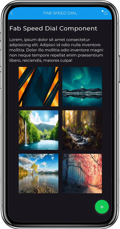
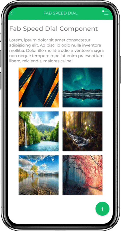
This component adapts to your theme colors automatically. However, you still can override the colors if you need to.
Requirements
Widget
<head>
  <!-- CSS -->
  <link rel="stylesheet" href="../../../styles/components/fabSpeedDial/fabSpeedDial.css" />

  <!-- JS -->
  <script src="../../../scripts/buildfire.min.js"></script>
  <script src="../../../scripts/buildfire/components/fabSpeedDial/fabSpeedDial.js"></script>
</head>
In your widget body, create an html container element for the FAB speed dial.
<body>
  <div id="fabSpeedDialContainer"></div>
</body>
Methods
fabSpeedDial()
new buildfire.components.fabSpeedDial(selector<String>, options<Object>);
Class constructor method which initializes the FAB component.
Only one FAB component can be active at once
Arguments
| Name | Type | Required | Description | Default |
|---|---|---|---|---|
selector | string | yes | CSS selector of the element that will contain the component | |
options | object | yes | Options object |
options
| Name | Type | Required | Description | Default |
|---|---|---|---|---|
mainButton | object | no | An object to customize the main FAB button | |
buttons | array | no | Array of FAB button objects | |
showOverlay | boolean | no | A visual element that is placed over the rest of the app when a FAB speed dial is opened | true |
You must provide either mainButton or buttons
options.mainButton
| Name | Type | Required | Description | Default |
|---|---|---|---|---|
content | html | no | The content that will render in the main FAB speed dial button | |
type | string | no | Changes the button background color. Options: default, primary, success, info, warning, danger | primary |
If the button content has an image, the recommended size is 56px by 56px
options.buttons
| Name | Type | Required | Description | Default |
|---|---|---|---|---|
content | html | yes | The content will render in the FAB speed dial button | |
label | string | no | This label will be shown next to the FAB speed dial button | |
type | string | no | Changes the button background color. Options: default, primary, success, info, warning, danger | primary |
onClick | function | no | Action to be executed when the button is clicked |
If the button content has an image, the recommended size is 68px by 68px
The buttons length should be up to 6 buttons. If exceeded, the component will only show the first 6 buttons.
If only one button is provided, it can be used as the main button if mainButton is not passed.
Example
const fabSpeedDial = new buildfire.components.fabSpeedDial('#fabSpeedDialContainer', {
  showOverlay: true,
  mainButton: {
    content: '<i class="icon">add</i>',
    type: 'success',
  },
  buttons: [
    {
      content: `<img src=${buildfire.imageLib.cropImage('https://app.buildfire.com/app/media/avatar.png', { width: 68, height: 68 })} alt="person">`,
      label: 'Alex Park',
      type: 'success',
      onClick: () => console.log('button clicked'),
      data: {
        id: '123456789abcd',
        firstName: 'Alex',
        lastName: 'Park',
        age: '23',
      },
    },
    {
      content: '<i class="icon" style="color:blue;">home</i>',
      label: 'Home',
      type: 'primary',
      onClick: () => console.log('button clicked'),
    },
    {
      content: '<span class="icon danger" style="font-size:30px; font-weight:700;">!</span>',
      label: 'Info',
      type: 'info',
      onClick: () => console.log('button clicked'),
    },
  ],
});
open()
function fabSpeedDial.open();
Opens the FAB speed dial buttons.
// Set up component options
const options = {
  mainButton: {
    content: '<i class="icon">add</i>',
  },
  buttons: [
    {
      content: '<i class="icon">home</i>',
      label: 'Home',
      onClick: () => console.log('Home button clicked'),
    },
    {
      content: '<span class="icon danger">!</span>',
      label: 'Info',
      onClick: () => console.log('Info button clicked'),
    },
  ],
};

// Instantiate FAB Component
const fabSpeedDial = new buildfire.components.fabSpeedDial('#fabSpeedDialContainer', options);

// Open the FAB speed dial
fabSpeedDial.open();
close()
function fabSpeedDial.close();
Close the FAB speed dial buttons.
// Set up component options
const options = {
  mainButton: {
    content: '<i class="icon">add</i>',
  },
  buttons: [
    {
      content: '<i class="icon">home</i>',
      label: 'Home',
      onClick: () => console.log('Home button clicked'),
    },
    {
      content: '<span class="icon danger">!</span>',
      label: 'Info',
      onClick: () => console.log('Info button clicked'),
    },
  ],
};

// Instantiate FAB Component
const fabSpeedDial = new buildfire.components.fabSpeedDial('#fabSpeedDialContainer', options);

// Close the FAB speed dial
fabSpeedDial.close();
isOpen()
function fabSpeedDial.isOpen();
Return true if the speed dial FAB is opened, and return false if it’s closed.
// Set up component options
const options = {
  mainButton: {
    content: '<i class="icon">add</i>',
  },
  buttons: [
    {
      content: '<i class="icon">home</i>',
      label: 'Home',
      onClick: () => console.log('Home button clicked'),
    },
    {
      content: '<span class="icon danger">!</span>',
      label: 'Info',
      onClick: () => console.log('Info button clicked'),
    },
  ],
};

// Instantiate FAB Component
const fabSpeedDial = new buildfire.components.fabSpeedDial('#fabSpeedDialContainer', options);

// Check if the FAB speed dial is open
const currentState = fabSpeedDial.isOpen() ? 'open' : 'closed';

console.log(`The FAB speed dial is ${currentState}`);
destroy()
function fabSpeedDial.destroy();
Destroys the speed dial component and removes its elements from the DOM.
// Set up component options
const options = {
  mainButton: {
    content: '<i class="icon">add</i>',
  },
  buttons: [
    {
      content: '<i class="icon">home</i>',
      label: 'Home',
      onClick: () => console.log('Home button clicked'),
    },
    {
      content: '<span class="icon danger">!</span>',
      label: 'Info',
      onClick: () => console.log('Info button clicked'),
    },
  ],
};

// Instantiate FAB Component
const fabSpeedDial = new buildfire.components.fabSpeedDial('#fabSpeedDialContainer', options);

// Destroy FAB Component
fabSpeedDial.destroy();
Handlers
The following event handlers can be assigned:
onMainButtonClick()
function fabSpeedDial.onMainButtonClick(event<Object>)
Triggered when a FAB speed dial's main button is clicked. Passes the main button data in the event parameter.
// Set up component options
const options = {
  mainButton: {
    content: '<i class="icon">add</i>',
  },
  buttons: [
    {
      content: '<i class="icon">home</i>',
      label: 'Home',
      onClick: () => console.log('Home button clicked'),
    },
    {
      content: '<span class="icon danger">!</span>',
      label: 'Info',
      onClick: () => console.log('Info button clicked'),
    },
  ],
};

// Instantiate FAB Component
const fabSpeedDial = new buildfire.components.fabSpeedDial('#fabSpeedDialContainer', options);

// Listen for main button click
fabSpeedDial.onMainButtonClick = event => {
  console.log(`FAB speed dial main button clicked`, event);
};
You can use this handler only if options doesn't contain buttons
onOpen()
function fabSpeedDial.onOpen()
Triggered when the FAB speed dial is opened.
// Set up component options
const options = {
  mainButton: {
    content: '<i class="icon">add</i>',
  },
  buttons: [
    {
      content: '<i class="icon">home</i>',
      label: 'Home',
      onClick: () => console.log('Home button clicked'),
    },
    {
      content: '<span class="icon danger">!</span>',
      label: 'Info',
      onClick: () => console.log('Info button clicked'),
    },
  ],
};

// Instantiate FAB Component
const fabSpeedDial = new buildfire.components.fabSpeedDial('#fabSpeedDialContainer', options);

// Listen for the component to open
fabSpeedDial.onOpen = event => {
  console.log(`FAB speed dial opened`);
};
onClose()
function fabSpeedDial.onClose()
Triggered when the FAB speed dial is closed.
// Set up component options
const options = {
  mainButton: {
    content: '<i class="icon">add</i>',
  },
  buttons: [
    {
      content: '<i class="icon">home</i>',
      label: 'Home',
      onClick: () => console.log('Home button clicked'),
    },
    {
      content: '<span class="icon danger">!</span>',
      label: 'Info',
      onClick: () => console.log('Info button clicked'),
    },
  ],
};

// Instantiate FAB Component
const fabSpeedDial = new buildfire.components.fabSpeedDial('#fabSpeedDialContainer', options);

// Listen for component to close
fabSpeedDial.onClose = event => {
  console.log(`FAB speed dial closed`);
};
onButtonClick()
function fabSpeedDial.onButtonClick(event<Object>)
Triggered when a FAB speed dial button is clicked. Passes the button data in the event parameter.
// Set up component options
const options = {
  mainButton: {
    content: '<i class="icon">add</i>',
  },
  buttons: [
    {
      content: '<i class="icon">home</i>',
      label: 'Home',
      onClick: () => console.log('Home button clicked'),
    },
    {
      content: '<span class="icon danger">!</span>',
      label: 'Info',
      onClick: () => console.log('Info button clicked'),
    },
  ],
};

// Instantiate FAB Component
const fabSpeedDial = new buildfire.components.fabSpeedDial('#fabSpeedDialContainer', options);

// Listen for button clicks
fabSpeedDial.onButtonClick = event => {
  console.log('FAB speed dial button clicked');
};
Arguments
| Name | Type | Description |
|---|---|---|
event | object | The clicked button object |
Full Example
A working example of a state-managed FAB Component that shows a customized user button, offers navigation to different plugins, and can open the user profile or prompt for login.
//*********************************** BUTTONS ***********************************//

// Default buttons
const goHomeButton = {
    content: '<i class="icon success">Home</i>',
    label: 'Go Home',
    type: 'primary',
    onClick: () => buildfire.navigation.navigateHome(),
};
const openSocialWallButton = {
    content: '<i class="icon" style="color:blue;">Sign Up</i>',
    label: 'Sign Up',
    type: 'primary',
    onClick: () => buildfire.navigation.openWindow("https://buildfire.com", "_system"),
};

// Build a profile button for the user, or a guest profile if not logged in
const buildProfileButton = user => {

    const { userId, firstName, lastName } = user;

    // Set default guest profile image
    let imageUrl = 'https://app.buildfire.com/app/media/avatar.png';

    // Get logged in user profile image
    if (userId !== 'guest') {
        imageUrl = buildfire.auth.getUserPictureUrl({ userId });
    }
    // Use CDN for cropping
    let profilePicture = buildfire.imageLib.cropImage(imageUrl, { width: 68, height: 68 });

    // Return the profile button object
    const profileButton = {
        content: `<img src="${profilePicture}" alt="person">`,
        label: `${firstName} ${lastName}`,
        type: 'success',
        onClick: () => openUserProfile(userId),
        data: user
    };

    return profileButton;

    // Open the user profile, or prompt for login
    function openUserProfile(currentUserId) {
        if (userId !== 'guest') return buildfire.auth.openProfile(currentUserId);

        buildfire.dialog.toast({
            message: "Please log in to view your profile",
            actionButton: {
                text: 'Login',
                action: buildfire.auth.login
            },
            duration: 1.5e3 // 1.5 seconds
        });
    }
};

//*************************** COMPONENT INITIALIZATION ***************************//

// Keep FAB Component reference for re-renders
let fabSpeedDial;

// Sets up a new FAB Component, and replaces the existing one if active
const initializeFabSpeedDial = user => {
    console.log('initializing FAB Component', user);
    // Set up FAB Speed Dial options
    const options = {
        showOverlay: true,
        mainButton: {
            content: '<i class="icon">add</i>',
            type: 'success',
        },
        buttons: [openSocialWallButton, goHomeButton, buildProfileButton(user)]
    };

    let isOpen = false;

    if (fabSpeedDial) {
        // Save open state if re-rendering
        isOpen = fabSpeedDial.isOpen();
        // Destroy existing FAB Component
        fabSpeedDial.destroy();
    }

    // initializes the FAB speed dial component.
    fabSpeedDial = new buildfire.components.fabSpeedDial('#fabSpeedDialContainer', options);

    if (isOpen) fabSpeedDial.open();

    // Triggered when the FAB speed dial is opened.
    fabSpeedDial.onOpen = () => {
        console.log('Triggered on open FAB speed dial');
    };
    // Triggered when the FAB speed dial is closed.
    fabSpeedDial.onClose = () => {
        console.log('Triggered on close FAB speed dial');
    };
    // Triggered when the main FAB speed dial button is clicked.
    fabSpeedDial.onMainButtonClick = event => {
        console.log(`FAB speed dial main button clicked`, event);
    };
    // Triggered when a FAB speed dial button is clicked.
    fabSpeedDial.onButtonClick = event => {
        console.log('Triggered on FAB speed dial button clicked', event);
    };
};

//**************************** AUTH STATE MANAGEMENT ****************************//

// Guest Profile
const guest = {
    userId: 'guest',
    firstName: 'Guest',
    lastName: 'User',
};

// Get the logged-in user. If not logged in, build guest profile.
// Entry point of this example triggers the initial render of the component
buildfire.auth.getCurrentUser((err, user) => {
    if (err) return console.error(err);
    initializeFabSpeedDial(user || guest);
});

// Rebuild FAB Component with user profile on login
buildfire.auth.onLogin(user => {
    initializeFabSpeedDial(user);
}, true);

// Rebuild FAB Component with a guest profile on logout
buildfire.auth.onLogout(() => {
    initializeFabSpeedDial(guest);
}, true);