buildfire.input
buildfire.input is a framework that allows your plugin to show a full-size view with multiple inputs to get user input data.
Methods
showTextDialog()
buildfire.input.showTextDialog(options, callback)
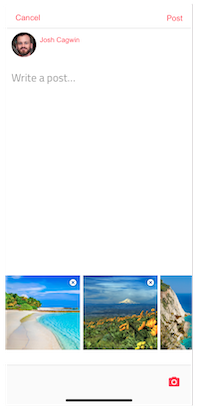
Displays a full screen text dialog that can be used to write text, wysiwyg content, upload images and more.
buildfire.input.showTextDialog(
  {
    placeholder: "Enter your title here",
    saveText: "Set",
    maxLength: 50,
    defaultValue: "HI",
  },
  (err, response) => {
    if (err) return console.error(err);
    if (response.cancelled) return;

    console.log(response.results[0].textValue);
  }
);
options
| Name | Type | Required | Description | Default |
|---|---|---|---|---|
placeholder | string | no | Input placeholder value | "Type something..." |
saveText | string | no | Save button text | "Done" |
cancelText | string | no | Cancel button text | "Cancel" |
doneText | string | no | When there are multiple steps and you have reached the end. | saveText value |
maxLength | number | no | Maximum input length allowed | 2000 |
defaultValue | string | no | Set pre existing value of input. Usually used during edits | |
defaultAttachments | object | no | Set pre existing value of attachments. Usually used during edits. defaultAttachments should not be used along with wysiwyg mode | |
wysiwyg | boolean | no | Used to switch text input to wysiwyg input | false |
attachments | object | no | Specifies which attachments to enable | |
confirmOnCancel | object | no | Detect any input changes and prompts the user to confirm dismissing the dialog if there were any. |
options.defaultAttachments
| Name | Type | Required | Description | Default |
|---|---|---|---|---|
images | [string] | no | Array of image urls | |
gifs | [string] | no | Array of gif urls | |
location | object | no | Geolocation object { long, lat, // address_name } |
options.attachments
| Name | Type | Required | Description | Default |
|---|---|---|---|---|
images | object | no | Enables the images attachment. Can allow multiple images to be uploaded { enable: Boolean, multiple: Boolean } | |
gifs | [string] | no | Enables the gif attachment. { enable: Boolean} | |
location | object | no | Enables the location attachment { enable: Boolean} |
options.confirmOnCancel
| Name | Type | Required | Description | Default |
|---|---|---|---|---|
enable | boolean | no | Enables confirmOnCancel option. | false |
titleText | string | no | Prompt title text. | "Unsaved Changes" |
messageText | string | no | Prompt body text. | "Are you sure you want to leave? If you leave now, all the information entered will be lost." |
confirmText | string | no | Confirm button text. | "Leave" |
confirmType | string | no | Confirm button type, used to specify the button style. Styles available: default, primary, success, info, warning, danger | "primary" |
dismissText | string | no | Dismiss button text. | "Resume" |
callback(err, data)
| Name | Type | Description |
|---|---|---|
err | string | error string, null when operation is successful |
data | object | Object containing cancelled and results |
data
| Name | Type | Description |
|---|---|---|
cancelled | boolean | Indicate if input dialog was cancelled |
results | [object] | Array of result objects |
data.results[]
| Name | Type | Description |
|---|---|---|
textValue | boolean | Text value the user entered. If wysiwyg is true, this will contain plaintext version of wysiwyg input without html tags. |
wysiwygValue | [object] | Html value of users input in wysiwyg mode.objects |
images | [object] | Array of image urls objects |
gifs | [object] | Array of gif objects |
location | [object] | Geolocation object `{ long, lat, // address_name } |
note
Images and gifs object will be empty if wysiwyg is true since these are embedded in wysiwyg content itself and will be returned in value.
Multiple Inputs
Sometimes you want the user to enter multiple values in order. To do this you can pass multiple option objects in an array.
const steps = [options1, options2, options3];

buildfire.input.showTextDialog(steps, callback);
showListDialog
buildfire.input.showListDialog(options, callback)
Shows a list dialog with multiple list options as a checkbox or radio button.
buildfire.input.showListDialog(
  {
    title: "List dialog",
    listItems: [
      { text: "Item 1", value: "item 1" },
      { text: "Item 1", value: "item 1" },
    ],
  },
  (err, result) => {
    if (err) return console.error(err);
    if (result.cancelled) return;

    console.log("Selected values: ", result.selected);
  }
);
options
| Name | Type | Required | Description | Default |
|---|---|---|---|---|
title | string | no | Dialog title | |
multiSelect | boolean | no | Allows multiple selection of list items. If true, list items are checboxes, otherwise radio buttons | false |
listItems | [object] | no | List of options to present to the user. | |
cancelButton | object | no | Changes cancel button text or value | {text: "Cancel", value: "cancel"} |
confirmButton | object | no | Changes confirm button text or value | {text: "Ok", value: "ok"} |
callback(err, data)
| Name | Type | Description |
|---|---|---|
err | string | error string, null when operation is successful |
data | object | Object containing cancelled and selected |
data
| Name | Type | Description |
|---|---|---|
cancelled | boolean | Indicate if list dialog was cancelled |
selected | [object] | Array of selected objects |